AREUS Pharma
AREUS Pharma Brand Name Design
In the world of pharmaceutical branding and packaging design, one name stands out, Areus Pharma, created by the creative powerhouse, Creative Trade Mark. This project represents a pinnacle of branding design, especially tailored for a pharmacy company aiming to make a lasting impression in the European (EU) and Scandinavian (SCANDINAVIA) regions. The essence of this article lies in the ability to convey the strength and premium quality of packaging design for medical care products, reflecting a professional standpoint.
The Main Goal of Packaging Design
Brand Loyalty: We aim to create a brand design that fosters loyalty, encouraging customers to return to Areus Pharma for their pharmaceutical needs.
Uniqueness: Our design embodies the uniqueness of Areus Pharma’s offerings in the market, setting them apart from the competition.
Trustworthiness: Through a professional and aesthetically pleasing design, we instill trust in the hearts of customers.
Strong Identity: Our work provides Areus Pharma with a strong and distinct brand identity, ensuring they stand out in the industry.
The Concept
The concept is rooted in creating a unique brand name design that evokes emotions and values. Areus Pharma strives to deliver a brand identity that resonates with customers, catering to their needs and preferences. The design emphasizes the value that clients seek and expresses it through an intricately crafted identity. This is a story of branding that captures the essence of what every customer craves.
The Solution
The process begins with an intensive strategic phase to lay the foundation and identify all brand touchpoints. The result is a symbol that embodies the brand’s core values of trust, security, and loyalty. The carefully chosen color palette exudes tranquility. It expands the brand’s reach across different communication channels, ensuring that it connects with potential customers while upholding the brand’s core values.
Logo Design
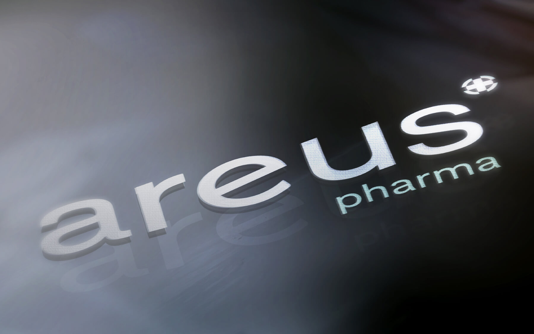
The “Areus Pharma” logo is a seamless blend of iconic symbolism, representing the heart of the brand. The logo incorporates elements that add a touch of empathy and warmth, mirroring the brand’s compassionate approach to healthcare. This design is intended to resonate with customers on a personal level, forging a strong emotional connection.
Icon
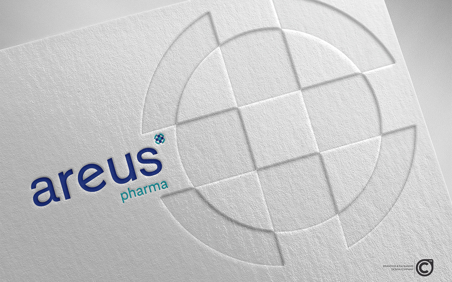
The distinctive icon, a cross within a circle, serves as a potent symbol for “Areus Pharma.” Our design professionals have stylized this icon explicitly for the brand, ensuring it communicates the brand’s values and identity effectively. This emblem speaks to the brand’s commitment to health and well-being.
Typography
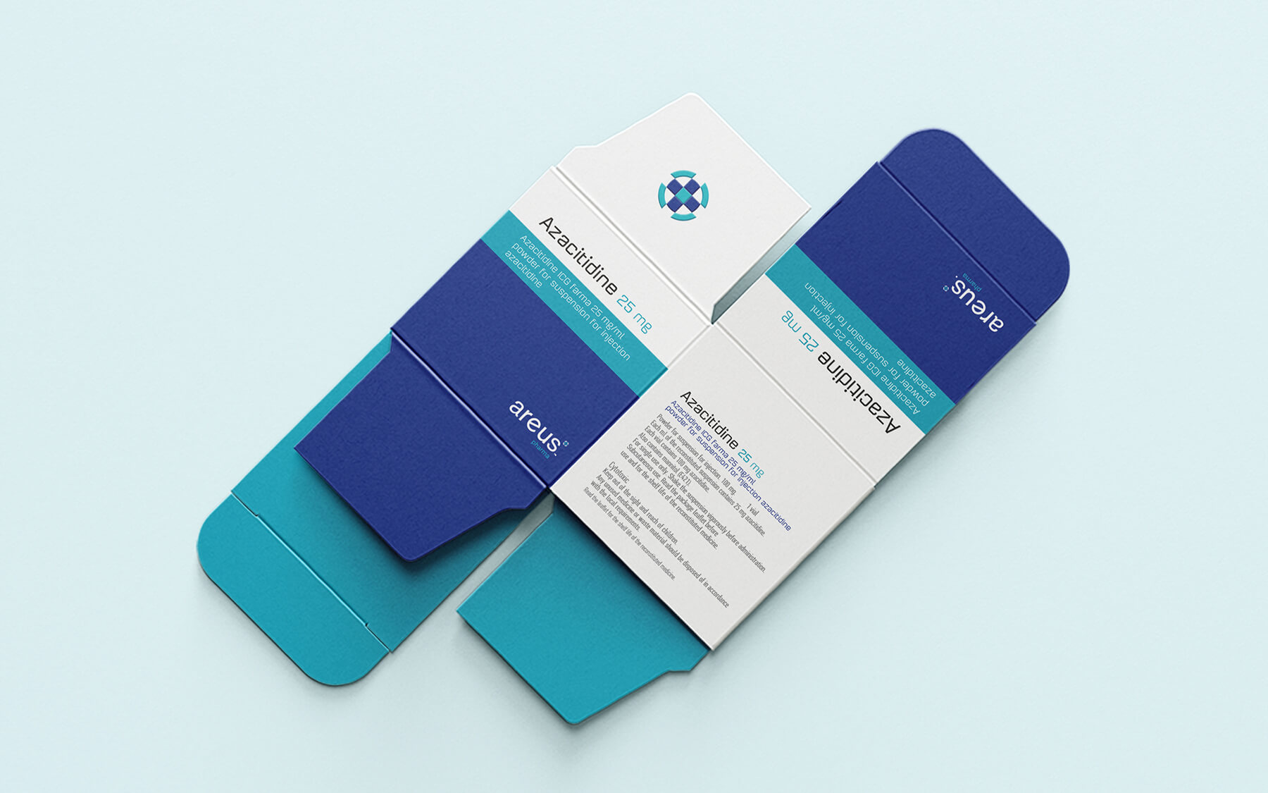
Typography is an essential component of any brand identity. For “Areus Pharma,” we’ve chosen a clean and versatile sans-serif font that exudes professionalism and a forward-thinking attitude. The use of lowercase letters conveys humility and respect, reflecting how we interact with our customers. This Scandinavian-inspired font has been meticulously refined by our graphic design team to ensure readability and a contemporary aesthetic, even on small surfaces like blister packs and labels.
Color Palette
The brand’s color palette blends soothing medical tones with vibrant accents. There are just two colors in this palette: deep blue and aquamarine. Aquamarine symbolizes happiness, hope, and eternal youth, evoking a sense of serenity, lightness, and purity. This calming, tranquil blue fosters feelings of peace and trust, encourages patience, and has a soothing effect on the senses.
Conclusion
In conclusion, the Areus Pharma packaging design is not just a project; it’s an artistic masterpiece. It combines artistry with precision, making it an embodiment of excellence in pharmaceutical branding. With a strong identity, trustworthiness, and a touch of empathy, Areus Pharma sets a new standard in the industry. Creative Trade Mark has indeed created something extraordinary.