CANIS
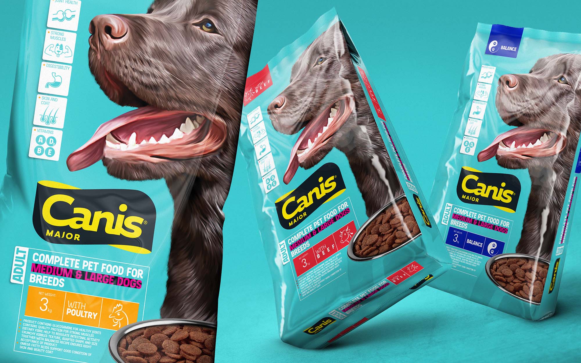
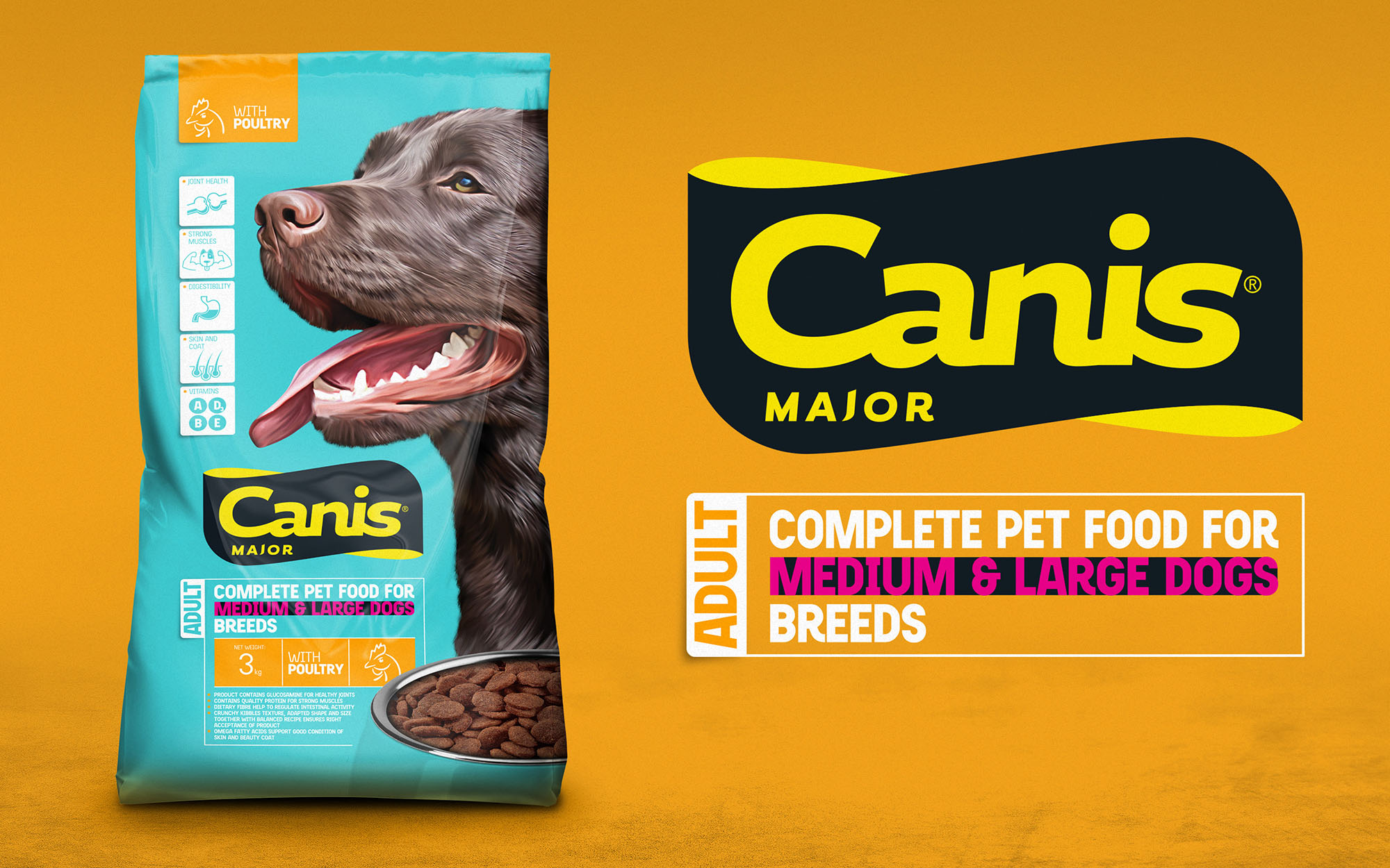
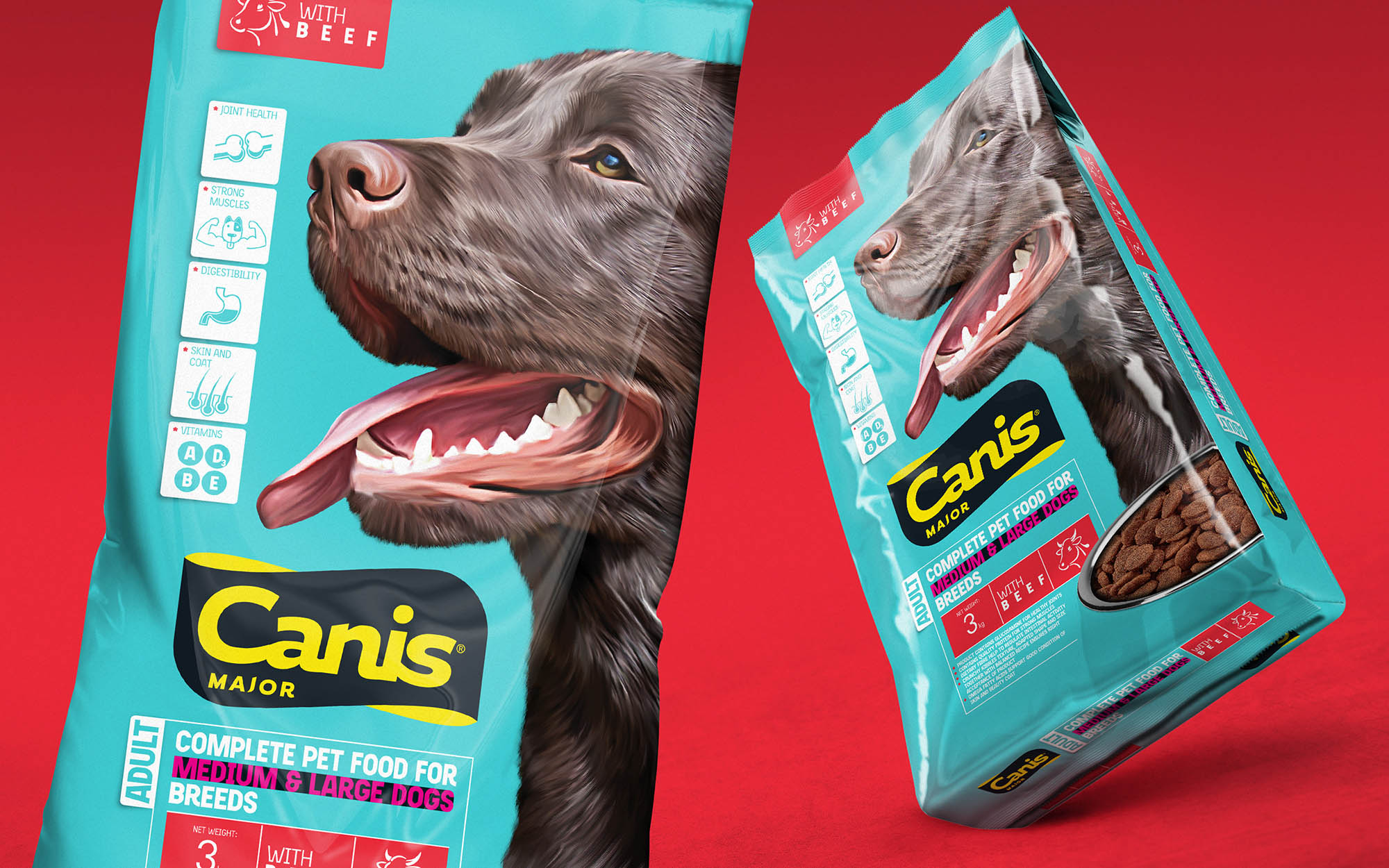
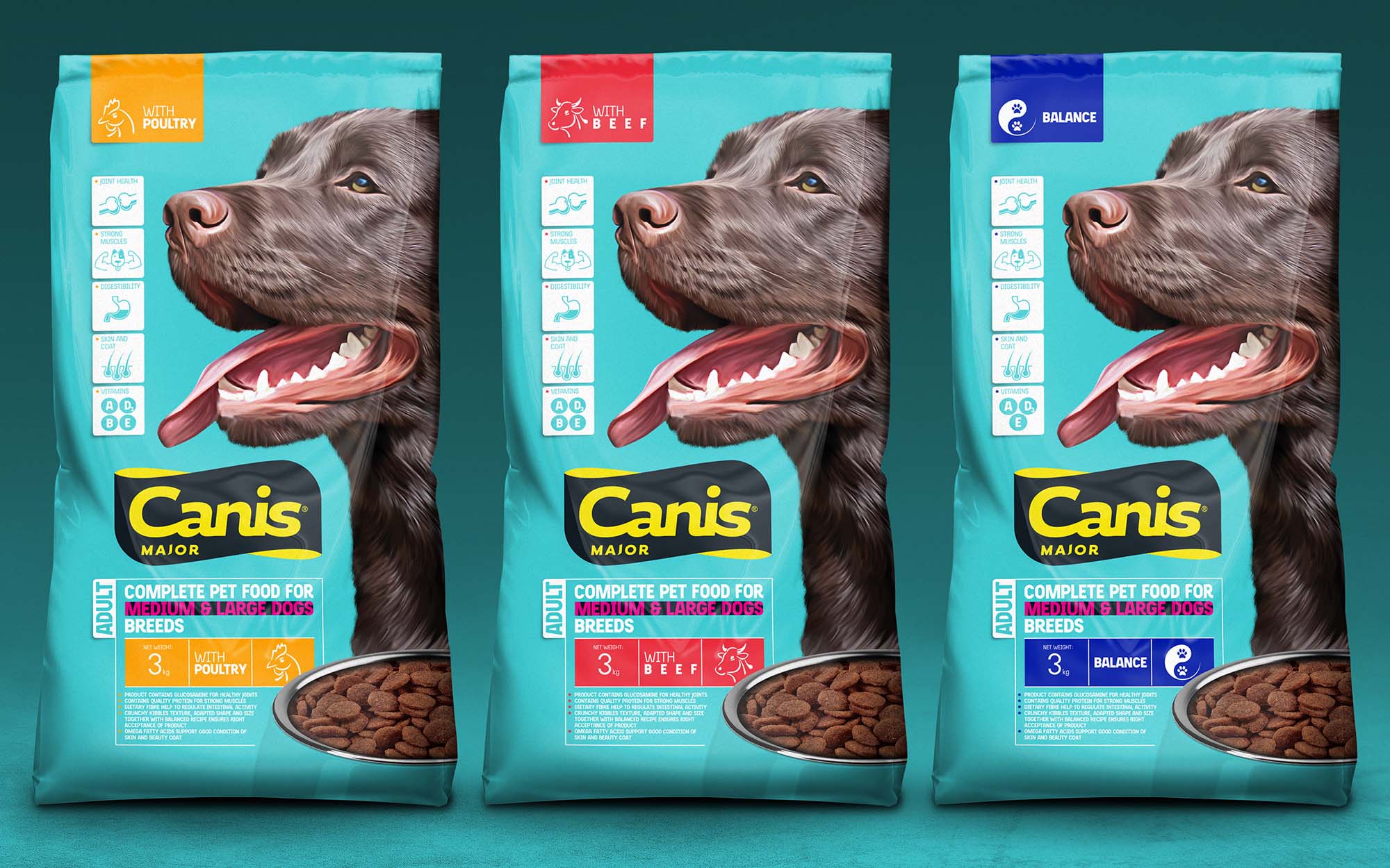
A harsh competition in the mainstream dog food category is a strong push for the Brand to identify their own uniqueness. We suggested to define it by using in packaging unconventionally bright colors and a special drawing technique to create the brand’s character. A smoothly resealable zip opening and a transparent window for identifying the product inside – just a few smart details to communicate the brand’s strengths, transparency and quality. The ultra bright and modern package design enabled the brand to enter the new markets, as well as added more clarity and brand identity to their communication.